
스토리보드 아티스트Mark kennedy 의 블로그글입니다.
일러스트레이터 Rowland B. Wilson로부터 전해진 메모의 내용들입니다
두파트로 나눠서 빛을 이해한 페인팅과 레이아웃
구도에 대한 내용을 소개하겠습니다.
1.빛을 색칠하기(Painting light)
*빛은 길을 인도한다.-색은 뒤따르고
(Light leads the way - color
follows)

각 레이아웃이
완료 될 때,전체 시퀀스에 대한 빛의 각도와 방향을 설정하십시오.
(As each Layout comes through, set
up the angle and direction of light for entire sequence.)

직선 모서리를 사용하여 캐릭터가 움직이는 영역과의 관계를 염두에 두고 정확한 빛의
패턴을 만들어보십시오.
(Use a straight edge and work out
an exact pattern of light , bearing in mind the relation of the character to
the area where it moves.)
음조 스케치를해라.(do tonal sketches.)

장면의 드라마를
고려하세요.
큰 순간을 위해 뭔가를 저장하십시오. 가볍거나
행복한 장면을 극적으로 묘사하십시오.
(Consider the Drama of the scene. Save
something for the big moments.Don,t over-dramatise a light or happy scene. )
"속임수"
속임수는 때때로 불가피합니다.
광원을 고려할 때 가능한 한 논리적 인 느낌을 갖도록하십시오.
("Cheat" cheat are
inevitable at times.
make them feel as logical as
possible - given the light source.)

(가독성을 위해 속이는 그림자.)
2.포스터화하기(Posterizing)
포스터화는 단순화를 의미합니다.
명확한 빛과 그림자 패턴을 만듭니다.
모든 물체를 가벼운면과 그림자면의 두 영역으로 축소합니다.
(posterizing means simplfying. create
clear light and shadow pattern.
reduce
all objects to just two areas: the light side and the shadow side.)

물체를 음영 처리하지 마십시오.
막연하지 마십시오.
그림자를 명확히하십시오.
(Don't shade objects. Don't be
vague. Make shadows definite.)
3.모서리(Edges)
빛과 그림자의 패턴을 설정하면 모서리의 부드러움이 결정됩니다.
(once you have established a
pattern of light and shadow, the softness of edges will determine)

1.초점
초점이 맞지 않는 물체가 가장 약합니다.
(.Focus object out of focus are softest.)

2.형태
둥근 물체는 각진 물체보다 그림자가 더 부드럽습니다.
(.Form round objects have softer shadow edges than
angled objects.)

3.거리
멀리있는 물체는 값의 대비가 감소하여 가장자리가 부드러워집니다.
(Distance distant objects have softer edges due to
decreased contrast of value.)

밝은 색상처럼 단단한 모서리는 물체를 좀더 화면에 가까워보이게 합니다..
(hard edges like bright colors
bring objects up closed to the picture plane.)
4.포커스(Focus)
포커스는 물체의 밝은면 (그림자가 아님)의 텍스처에 의해 만들어집니다.
하이라이트 및 기타 세 번째 톤이 여기에 속합니다.
(focus is created by texture in the
light side( not in the shadow) of an
object. highlights and other third tones belong here.)
초점 영역 밖의 밝은 부분은 부드럽게 해야 합니다.
(highlights outside the focal area
should be softened.)

* 세 번째 톤 : 밝은 톤 또는 그림자 톤의 변형.(third tones;a variation in the light tone or shadow tone.)
포커스는 캐릭터 근처에 속합니다.(Focus
belong near the character.)
5. 일관된 빛(Consistent
light)
빛은 동일한 차이 (빛과 그림자의 차이)를 남김으로써 일치 된 상태를 유지합니다.
(light is kept consistent by
holding the same difference (of light to shadow) throughtout.)

하나의 값은 그림자가 더 어두움(one
value darker in shadow)
그림자가 더 어두운 3 가지 값(three value darker in shadow)
예외.(Exceptions.)

프레임 구성
요소(Framing elements)
일반적으로 더 어둡게, 프레이밍 요소는
여전히 중앙 영역과 관련되어 있어야합니다.
(conventionaly darker,Framing
elements should still be related to central areas.)
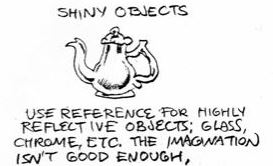
반짝이는 물건(shiny objects)
반사가 심한 물체 (예 : glass.chrome)에 대한 참조 사용
상상력이 충분하지 않다.
(use reference for highly
reflective objects:glass.chrome,etc,the imagination isn't good enough,)

다중 광원(multiple light
sources)
6.반사광(Reflected Light)
반사 된 빛은 종종 과장됩니다. 전혀
사용하지 마십시오.
(refected light is often overdone. don't
use any at all in)

강한 빛과 반짝이는 물체에서만 사용하십시오. 그것은
넓은 영역에 전이 음영으로 나타날 수 있습니다.
꼭 그럴 필요가 없는 것들을 반짝 거리지 마십시오.
(use it only in strong light and
shiny objects. it can appear as transitional shading in large areas.

Don't make things shiny that
needn't be.)
어디 에나 하이라이트를 두지 마십시오.
그러나 그들이 무엇인가 의미하는 곳에서 그들을 예비하지 마라!!
(don't put highlights everywhere. but
don't spare them where they mean something!!)
7.전이 음영(transitional shading)
트랜지션 쉐이딩은 한 영역 전체의 보여지는 밝기나 색상의 번짐(변화)를 말합니다.
transitional shading is a change of
value or color across an area.
넓은 지역에
보관하십시오. (save it for large areas.)

그것을 사용하여 공간을 만들고 "일반
카드"BG를 활발하게 사용하십시오.
그것을 빛으로 논리적으로 만든다.
(use it to create space and
liven-up a "plain card" BG.make it logical with light.)

단적으로; 초점 영역에서 약간 선명하게가는
부드러운 가장자리 포스터를 페인트합니다.
(in short; paint a soft-edge poster
which goes a bit sharper in the focal area.)
댓글 없음:
댓글 쓰기